 |
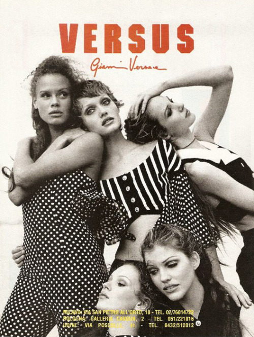
| Versus Versace, 1993 |
On the whole, Anderson succeeded in his mission to reference both aesthetics - the fetishistic crop tops and semi-sheer dresses shown on the men were distinctly Anderson, whereas flashes of burnt orange and electric blue on short evening dresses were pure Versace. The clean lines of Anderson and the bold colours of Donatella worked well together, especially when the fabric choices were somewhat unconventional. For example, knitted skirts and halter-neck tops came in a variety of hues but, when teamed either with a piece of the same colour or plain white trousers, the result was surprisingly effective.
Anderson also experimented with zebra-print - an experiment which produced several results, all of which were varied in terms of success. When shown more literally, the print felt like an example of Anderson repeating the tried-and-tested codes of the house, but an abstract version of the print saw diamonds of black and white interspersed onto a shaggy halterneck crop top which was both fresh and modern. When teamed with a skirt consisting heavily of safety pins and a backcombed mohawk, the overall look seemed to be the embodiment of Anderson's aesthetic combined with the punk spirit of the Versus collections. Donatella herself coined the term 'Vunk' (Versace punk) to describe some of her latest work, and this collection embodied that description. The greatest thing about this collection is that it managed to be 'punk' without being cliché; there was hardly any leather in sight, yet the messy hair and lack of accessories gave the impression of effortless cool - the kind of 'punk' that everyone can aspire to be.


No comments:
Post a Comment