

Thursday, 1 August 2013
CELINE BY JUERGEN TELLER
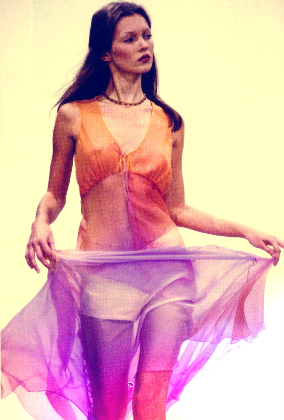
This week has seen a series of powerful fashion houses unleash advertising campaigns for their latest collections - from Adriana Lima at Miu Miu to Edie Campbell for Alexander McQueen, the variety of models, photographers and images used has been intriguing. This post is based on one of my all-time favourite campaigns, Céline's S/S 2010 collection, shot by Juergen Teller.
 Dutch photographer Teller is renowned for his simple, humanist approach to photography. His images tend to be minimalist with little in terms of background, leaving the camera to focus entirely on subject. He has produced iconic images of supermodels such as Kate Moss and Devon Aoki, making him the perfect choice for the chic French fashion house.
Tuesday, 30 July 2013
VIVE LA COCOTTE
History can be an extremely important reference point for many designers, but none more so than for Vivienne Westwood. Renowned for her intellectual approach to fashion design, one of Westwood's tricks is to take tailoring techniques from the past and bring them firmly into the present and this, her A/W 1995 collection is a perfect example of her ability to seamlessly blend the old with the new.

The collection provided social commentary from a number of different angles - the dresses themselves were padded both in the breasts of the corsets and the rear to emphasise the focus on those specific areas of the female form. One corset was embellished entirely and decorated with two ruby nipples - a nod towards the more playful side of female sexuality. Westwood herself is no stranger to sexual imagery, having previously used fetishistic items such as gimp masks in ad campaigns for her previous collections, but the sexual references in 'Vive La Cocotte' were more erotic than crude. The one obvious point of reference for the collection's aesthetic is Marie Antoinette - the heavy white makeup, corseted waists, full skirts and powdered wigs were pure French Revolution glamour and were the perfect example of the one thing that Westwood does better than any other - excess.

The collection provided social commentary from a number of different angles - the dresses themselves were padded both in the breasts of the corsets and the rear to emphasise the focus on those specific areas of the female form. One corset was embellished entirely and decorated with two ruby nipples - a nod towards the more playful side of female sexuality. Westwood herself is no stranger to sexual imagery, having previously used fetishistic items such as gimp masks in ad campaigns for her previous collections, but the sexual references in 'Vive La Cocotte' were more erotic than crude. The one obvious point of reference for the collection's aesthetic is Marie Antoinette - the heavy white makeup, corseted waists, full skirts and powdered wigs were pure French Revolution glamour and were the perfect example of the one thing that Westwood does better than any other - excess.
Monday, 29 July 2013
DESTROY
The concept of deconstruction in the world of high fashion is an interesting one. High fashion tends to conjure up the image of luxury - of flattering hemlines, high-quality materials and a general aura of glamour. For garments to be labelled and sold as high-end fashion, there has to be a sense that the buyer is getting value for their money, which is why it is so surprising that one of fashion's most powerful houses is based principally upon concept as opposed to commercial viability.

Ever since establishing her place in the fashion industry with her 'Hiroshima Chic' aesthetic, Rei Kawakubo has continued to push the boundaries of commercial clothing with her own sombre brand of beauty. Choosing to use black for the majority of her collections immediately set her aside from her flashier peers, but it was the use of deconstruction within Comme des Garçons 'Destroy' collection that truly divided critics.
Ever since establishing her place in the fashion industry with her 'Hiroshima Chic' aesthetic, Rei Kawakubo has continued to push the boundaries of commercial clothing with her own sombre brand of beauty. Choosing to use black for the majority of her collections immediately set her aside from her flashier peers, but it was the use of deconstruction within Comme des Garçons 'Destroy' collection that truly divided critics.
THE GRUNGE REVIVAL
It comes as no surprise that street style is looking more and more towards the 90s for inspiration, with designers such as Hedi Slimane and Dries van Noten spearheading the recent 'grunge revival' on the runway. Plaid shirts, ripped denim and visible roots are making a real comeback, and this post is dedicated to the collection that (in my eyes) best epitomises the trend in its heyday. Designed by Marc Jacobs for Perry Ellis, the show featured a slew of high-profile supermodels such as Naomi Campbell, Kate Moss and Kristen McMenamy, all decked out in beanies and printed harem trousers.
The collection almost seemed as if it had been engineered to combat the traditional "stoner" stereotype of the grunge look - in amongst the denim were a series of ultra-feminine looks that embodied the spirit of the trend with their loose, billowing fabrics and irridescent colours. More than anything, it was as though Jacobs had designed the collection with a character in mind, focusing less on the clothes and more on the woman that would wear them.
 |
| Kate Moss for Perry Ellis SS1993 |
Tuesday, 23 July 2013
UNDERCOVER
I'm sure that by now most of you are aware that I'm attracted to the more macabre aspects of high fashion - the mark of a true creative is to take an aesthetic which is traditionally seen as 'grotesque' and turn it into something strangely beautiful. Although not widely known, one of the most successful examples of this is entitled 'Guru Guru', and it comes courtesy of Japanese cult icon Jun Takahashi, founder of 'Undercover'.

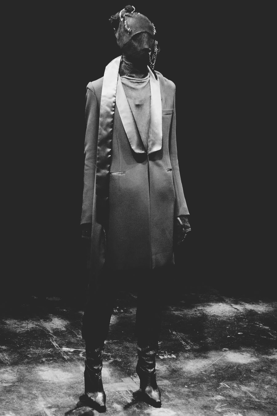
It is of course that Takahashi is not the first designer to use masks to make a statement on the runway - designers such as Viktor & Rolf have featured masks in the past and it is of course the signature look of Belgian fashion house Maison Martin Margiela, but the difference is that Takahashi's masks have been designed with horror in mind. Whilst Margiela's masks are often jewelled or made of chiffon, the masks in 'Guru Guru' are far more severe. Primarily made of leather, wool and suede, the hoods were pierced with various metal chains and spikes, underlining Takahashi's intention to establish an extreme, macabre aesthetic.
Friday, 19 July 2013
VERSUS VERSACE X J.W ANDERSON
One of the most difficult tasks within any creative industry is to create something that is truly original, which is one of the reasons that the fashion industry has recently taken to looking back through the decades and putting a fresh twist on some of the most memorable looks. Vintage shops have seen a huge surge in popularity, whereas houses such as Maison Martin Margiela have trawled their archives to present new, "reworked" versions of vintage favourites - it used to be seen as uncool to wear anything last-season, whereas now the fashion industry is demanding a mixture of the old and the new. One of the best examples of this trend is the Versus Versace 2013 collection - originally started by Gianni Versace back in 1993, the diffusion line has existed separately from the mainline collection as an affordable way to bag a piece of the house's inimitable aesthetic.
There was a huge buzz surrounding the 2013 collection - based on the success of his critically-acclaimed eponymous label, all eyes were on J.W Anderson for his first collection as creative director of Versus. Anderson is renowned for his conceptual take on fashion, which left many puzzled as to why he had been chosen for the job. Due to the fact that his collections usually focus on androgyny, dramatic silhouettes and a clean monochrome colour palette, many struggled to see how he would find a middle-ground between his minimalism and Versace's bold, colourful aesthetic.
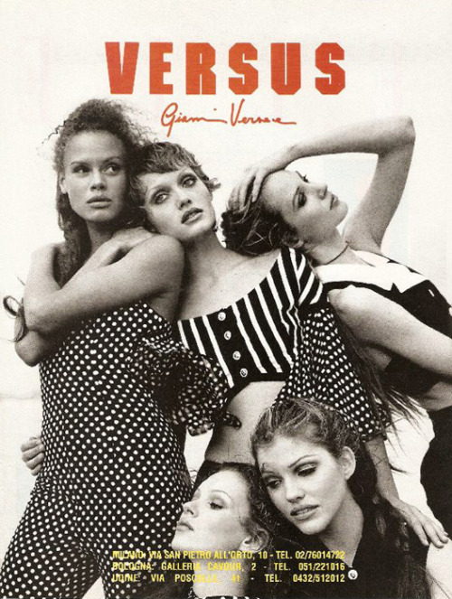 |
| Versus Versace, 1993 |
Thursday, 18 July 2013
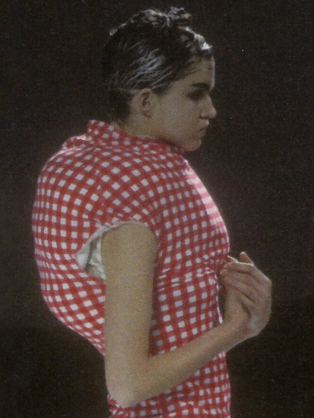
BODY MEETS DRESS, DRESS MEETS BODY
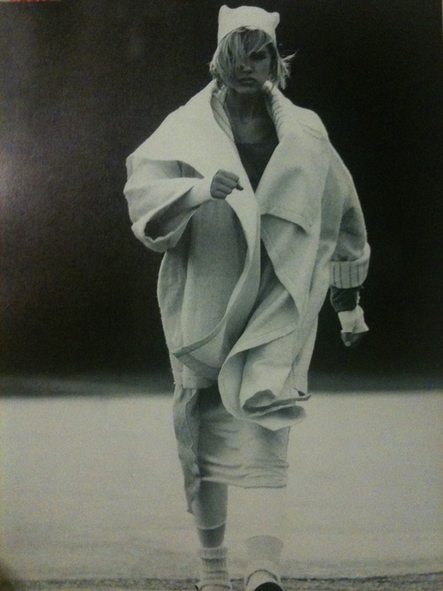
Whilst many designers become hugely successful in their own right, very few manage to create collections that are conceptual and avant-garde whilst also being selling enough of the collection to sustan a lengthy career. Rei Kawakubo, however, is now in her fourth decade in the fashion industry and her house, Comme des Garçons continues to thrive. Renowned for her desire to push the boundaries of wearability and challenge modern perceptions of "fashion" Kawakubo has created many iconic collections but this, her Spring/Summer 1997 collection, is arguably the most iconic.

The collection, entitled "Body Meets Dress, Dress Meets Body", was based on the concept of a woman being physically attached to her burdens. The dresses in the collection were disfigured with wads of padding which led many to criticise Kawakubo for deliberately creating a collection that was deemed to be unflattering and "anti-feminine". In addition, there was debate as to what the "burdens" were supposed to be - in some cases the padding was shaped like a baby in a sling, an obvious commentary on the weight of motherhood, but in other cases the lumps were attached to the hip, leaving an ambiguous meaning.
The collection, entitled "Body Meets Dress, Dress Meets Body", was based on the concept of a woman being physically attached to her burdens. The dresses in the collection were disfigured with wads of padding which led many to criticise Kawakubo for deliberately creating a collection that was deemed to be unflattering and "anti-feminine". In addition, there was debate as to what the "burdens" were supposed to be - in some cases the padding was shaped like a baby in a sling, an obvious commentary on the weight of motherhood, but in other cases the lumps were attached to the hip, leaving an ambiguous meaning.
Subscribe to:
Posts (Atom)